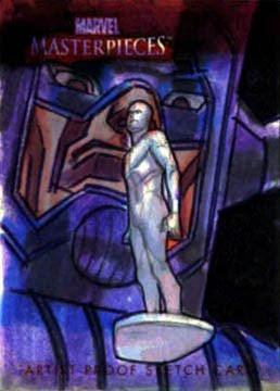

 As you can see... This wasn't much of a "sketch" card.. I had a concept and wanted to know it was going to work out..
Initially I sketched out this concept and just threw some markers on it.. I really like the Silver Surfer but wasn't that hot about Galactus. So I spent some more time working on the Galactu s Face that you see in the pencil sketch.
I actually use the old "graphite-rub" technique to get the drawing as close to the original as possible.
I used a purple "Pitt Pen"( from Faber Castell) to ouline all of the shadow areas. This is the technique that I learned from Brian Stelfreezes water color workshop. You fill the shadow areas with a strong purple in the starting stages. That's the only part of the technique that I used on this. The card really resisted any watercolor pigment soaking in.
So I figured I'd have to rely on gouache. This is when the real fun started.. The pain went down very smooth and even. I made sure not to use too many colors on G's face.. I felt that three values would honestly say everything I wanted.
From there I just noodled away. Did a lot of color mixing, but I would completely cover up the previous color to keep the number of values down to around three on the face..
I keep mentioning G's face, and that's because I feel that's what pulls the composition together.. SS is cool, but he's kinda easy to do.. G's face really grounds the image into reality. And I keep mentioning the number of values because if you start getting too many colors on the pictures, it starts to fall apart.
I feel that a painting should be able to look very good with only 3 or 4 colors. If it's not looking good, then you just haven't used the colors the right way.. The inclination of most beginning painters is to find that special color that will make it right.. It doesn't.. It just makes a mess. So that was my philosophy as I searched for the right colors for this. And I definitely did some trial and error.
The cool thing about gouache is that you cn re-wet it and smooth out the colors. BUT another mantra I paint by is that you don't get honest gradation only by a smooth transition between two colors.. You need to have a honest transition between the right harmony of colors.. Or course I've limited myself to only three- but I kept searching for those three that played well together.. So in the end.. I didn't do any smoothing of color.
No colored pencil on this on either.. Which transitions into the Doc Strange card.. It was started about the same way as the SS, But I used a collection of Pitt pens to add a little more color at the beginning.. I threw in as marker as I could then shifted to gouache and then colored pencils.. It was a very mixed media experiment.
(BTW, the thing that makes Pitt pens so grand it they are pretty much like writing with transparent acrylic paint.. They play very nicely with watercolors, acrylic, and gouache.
That's it..
*edit* I just noticed.. It's not just my monitor.. Blogger lightens up any pictures that I upload to it.
Monday, April 20, 2009
Surfer Card breakdown.
Posted by
riq
at
9:08 PM
![]()
Labels: sketch, sketch card
Subscribe to:
Post Comments (Atom)


3 comments:
Thanks! Very informative. I have really enjoyed learning about peoples techniques and media through their blogs. I have been hiding under my rock too long, need to learn new things:)
I have never heard of Pitt Pens, just looked them up, I think I will be picking some up to try out. How would you compare them to Copic Markers? (if you have had the opportunity to use Copic). I haven't touched my Gouche in years, seeing your work makes me want to get them out again.
Thanks again for this post, very enlightening!
Pitt pens are very different than Copic markers in my opinion.
Copics are an ends and a means to me.. They're amazing in how effortless they are to use, and their refillability make them very affordable over the long run.
I've actually decided to switch over all of my small painting to be done mainly with copics and then use some watercolors for clean up.. I'll do all coloring in photoshop. If you look at my "artifacts for White Wolf" post, that's the technique that I used there.
Pitt pens are just part of your arsenal.. They're great for very flat applications of color, and usually just making rules or lines. Not much good in tonal or gradation applications.
I love the behind the scenes on art, thanks for taking the time to do this.
Post a Comment